

Amstrad CPC conversion programmed by Stefan Walker, with artwork by Murray Taylor and sounds by Ken Lagace. Released in 1987.
Converted for the IBM-PC compatibles by Randall Don Masteller, with: Graphics and artwork by Michael O. Haire, Andy Hollis, Randall Don Masteller, Gregg Tavares and Murray Taylor; Music and sounds by Ken Lagace. Released in 1987.
Apple ][ conversion programmed by Ed Magnin and Tony Dahbura, with artwork by Michael O. Haire, Murray Taylor and Iris Leigh Idokogi, and sounds by Ken Lagace.
Apple //GS conversion programmed by Ed Magnin and Dan Chang, with artwork by Michael O. Haire, Murray Taylor and Max Remington, and sounds by Ken Lagace and Silas Warner. Both Apple conversions released in 1988.
Also converted for the Macintosh by the MicroProse team, and released in 1988. Further credits unknown. Also converted for the NEC PC-88 and PC-98 computers in 1989, but no further information is known.
Atari ST conversion programmed by Steve Bohrer, Russell Finn and Ken Veale, with graphics by Max D. Remington III and sounds by Ken Lagace. Released in 1989.
Commodore Amiga conversion programmed by Steve Bohrer, with graphics by Kim Biscoe and sounds by Ken Lagace. Released in 1990.
Converted for the Nintendo Entertainment System by Rare Ltd. and released through Ultra Games for the North American market, and through Palcom for the European market in 1991.
---
INTRODUCTION & GAME STATUS
For the last comparison entry for my second year of intense blogging, I have not chosen Defender of the Crown, as I originally planned (as you might have guessed from the preview picture I made last August), because it turned out to be practically impossible for me to do for various reasons. Instead, I was cornered to do one of my earliest and most frequent requests, and certainly a classic: Sid Meier's Pirates! This comparison was made within a three month period, and the resulting entry is the longest single comparison I have made so far. So, before you click on to read further, make sure you have plenty of time and refreshments at hand. Also, a word of warning: *This post is heavy on graphics, so be patient. Also, if your internet deal has a data limit, read this one elsewhere.*
Sid Meier games could be called as their own category, or at least a sub-category of strategy/simulation games. The famous labeling of them as Sid Meier's started with Pirates!, which couldn't have been a more suitable entry in the series to begin the branding. Of course, most people know him as the creator of the Civilization series, but us old folks will always remember his earlier efforts with great fondness, and I do urge every newcomer to seek out such titles as Silent Service, Kennedy Approach, F-15 Strike Eagle, Gunship, Red Storm Rising, Covert Action, Sword of the Samurai and Railroad Tycoon.
The reason why Pirates! had Sid's name included in the title was an effort by the publisher MicroProse to attract fans of Meier's earlier games, most of which were combat vehicle simulators. This is the first game from Meier to take a more adventure-driven direction, and the first one to get more than one sequel or a remake. The problem with having such a popular and massive franchise is that it's difficult for me to write about with any degree of credibility, particularly as I have to skip a couple of versions because I haven't found any method of testing them without the actual machines. Still, as Sid Meier's Pirates! is currently my most requested game to write about, this one goes out for every one of you who ever requested it - hope this meets your approval.
Just to make it clear, the two versions I shall be skipping, at least for now, are the two NEC PC versions. They were (or it was) only released in Japanese, so even if I understood how to make the disk images actually load beyond an error message (at least, that's what I think it is) on an emulator, I wouldn't be able to properly understand how to play the game in Japanese.
At the time of release, Pirates! received rather mixed reviews, but from what I've gathered, it wasn't quite as well understood by the regular gaming press as it is now. Currently, (or to be more precise, at the time I started working on this entry,) the original C64 version has a score of 8.9 from a total of 313 votes at Lemon64, ranking at #4 at the Voters' Top 100 list based on at least 100 votes, making it the highest-rated C64 game the blog has had so far. CPC Softs shows us a rating of 17.83/20.00, and at CPC Game Reviews, the reviewer has given it a round 10 out of 10. At Abandonia, the editor has given the DOS version a fairly expected 5.0, while 2113 readers have rated it 3.2. The Atari ST version has been rated a well rounded 8.0 from 88 votes at Atarimania, and the Amiga version has an even more impressive 8.72 from 218 voters at LemonAmiga, ranking it at #21 at the Voters' Top 100 list based on at least 100 votes. At Questicle, the NES version been given an A- rating, which is probably the most interesting one of the lot. The rest of the scores had to be taken from MobyGames again, and in an alphabetical order, here we go: Apple ][ - 3.6 from 7 votes; Apple //GS - 4.5 from 2 votes; Macintosh - 4.0 from 5 votes; NEC PC-88/PC-98 - 4.3 from 3 votes for both. And with such an astounding number and quality of scores, you always get a happier start for a comparison.
---
DESCRIPTION & REVIEW
It needs to be said to start this off on the right foot - there is nothing quite like Sid Meier's Pirates! out there. It's impossible to even describe in a few words, but one can always start to unweave this complex ball of yarn with giving a few genres as pointers: adventure, simulation, strategy, action and perhaps even romance. There are several plotlines you can follow as a swashbuckler of several optional skills, allegiances and purposes, but it's up to you to find the most suitable route for you. For a more thorough list of concepts and ideas that the game provides, check out this list at TVtropes.org.
Most of the game will be spent out on the Caribbean Sea, sailing the often difficult waters with winds throwing your fleet around, enemy ships forcing you into battle, rough terrain and crew often being at odds with either you or each other. The land bits of the map can also be marched through, but since the game progresses at a rather quick pace, your crew can get easily bored, and require lots of action and payment for their loyalty. All of this is shown from a kind of a top-down perspective, as are the actual battle segments, apart from the sword fights, which are side-viewed, and feel like a strategic version of Karate Champ or something. In addition to all the sailing and fighting, you can also hunt for treasures by purchasing treasure maps from suspicious characters in taverns, as well as woo every governor's daughter and find your long-lost family scattered around the Caribbean Islands. To get all of this completed, you need to learn how to use your every skill to your advantage, handle your crew well and have a good amount of time to play the game in the first place. Without at least a few free days, you won't be able to complete the game. But in my experience, Pirates! is not necessarily even the sort of a game you play to complete.
It's not a perfect game by any means, but it's as close as you will get to one of its kind, because it really is one of a kind. The amount and the variety of gameplay this game offers is not only astounding for its age, it is rather remarkable even now. As such, it is next to impossible to review without any expected superlatives, so I will just say, everyone who considers themselves a proper gamer has an obligation to try this out properly at least once. It can be just as addicting as any other addicting game ever, but being a strategy game at heart, it can be a rather slow and uncomfortable game to get into for more modern gamers who require all action to be instantaneous.
As some of you undoubtedly are aware, Pirates! has been completely remade twice in order to make it more playable on newer machines (Pirates! Gold in 1993 and the enhanced 2004 remake), but apart from the audiovisuals, the newer Pirates! games offer very little additions to the gameplay. Most fans of the original seem to even feel that the original still plays the best out of all the versions done since. I'm not here to compare the original against the newer versions, but the original versions for all platforms it was released on; however, I will be doing an extra bit about the two remakes after the main course.
---
PLAYABILITY
Like for most of other Pirates! fans, my first experience with the game was on the Amiga, and right from the start it felt exactly the sort of game that was completely at home there. Only a year or so after having played the Amiga version, I found that there was a C64 version as well - one of my friends had it. Imagine my surprise, when it turned out to be a cassette version! It just didn't make any sense, since the game is very non-linear and random at heart, and since there is so much information to load in the game. It still doesn't make any sense, but there you go - there is a cassette version of Pirates! on the C64, and no other computer. Thankfully. Even more thankfully, the game can be bought on a disk as well, if you're thinking of hunting an original down from eBay. Strangely, though, there is only about 14 minutes of data to load on the tape - both sides together, so it's not too bad, but it's still weird. But enough about the loading stuff, let's move on to the game itself.
At the very beginning, or more specifically, after the intro bits, the game gives you a bunch of starting menus. There you need to decide, whether you want to load a previously saved game, or start a new adventure from one of several scenarios. The other choices you need to make are your nationality (English, French, Dutch or Spanish), your skill level and your expertise in one of five abilities, each of which will contribute to your adventures in a considerable way. The five skills and their effects are: Fencing makes sword fights easier; Navigation makes sailing easier; Gunnery makes battles at sea easier; Medicine will give you the potential to medicate your crew and make your career last longer; Wit and Charm will make it easier to keep the crew happy and charm Governors and woo their daughters.
Before you actually get to do some adventuring, the game gives you a copy protection check of sorts: you need to know when either the Silver Train or the Treasure Fleet arrives in a certain city in a certain year (depending much on your chosen starting period), and the information can be found from the manual. Actually, you can continue to play the game even with an unpromising start, but the game will be considerably more difficult to start off with a bad start - everyone will be hostile to you, and you will start off with no cannons in your ship.
Up to this point, the game hasn't been much else than joystick- or mouse-driven text-item menus, and in fact, much of the game is precisely that. Whenever you encounter another vessel sailing the seas in your near vicinity, or whenever you get near a town and do business therein, or whenever you decide to check your status and perhaps save the game or something, a similar menu will occupy your time. But that's where most of the strategy and plot elements of your chosen adventure are dealt with, so you won't really get to think of it as being boring, because it's such a natural part of the game. Or at least that's how we think of it. So I will quickly get through the most important bits for the menu-based gaming parts.
In towns, you are mostly welcome to visit the local Governor, whose attitude towards you entirely on your reputation. Through each Governor, you are able to get more land and new titles depending on your performance for their country, and eventually, you might be able to woo their daughters and seek for knowledge of your long-lost family. You can also visit the local tavern, where you can catch up with the most current pirating news, sign-up some new crew, buy new information on other towns from travellers and buy treasure maps from shady characters. If you're not hostile to the nation of the town you are visiting, you are also able to trade with a local merchant, who is not only able to supple you with food, cannons, goods and sugar, but also buy or fix your boats if the need arises. In a friendly town, you can also divide up the collected plunder between your crew and yourself, and thus either choose to end your pirating days or continue with a higher difficulty level.
When you are sailing, you can pop up the basic information menu by pressing the fire button - this can also be accessed in towns by choosing the "Check information" menu item. Here, you can check your own status, your crew's status, any special maps you might have or information on cities, and you can also save your game. Only when at sea, you can also take sun sight, which might be helpful when sailing long stretches of horizonless sea.
Much of the game involves traveling, either by a boat (up to a fleet of ships) or by foot. Just plain sailing or marching and looking for some action can become dangerously boring after a while, because traveling takes time, which means that food will be consumed, and depending on your crew's number and mood, you might find yourself in trouble more quickly than you would imagine. So, you will notice that any sort of action will be often welcome to keep the crew more alert and spirited, but then again, attacking something considerably more powerful than yourself can prove to be too much of a challenge. For these sorts of situations, you really need to keep an eye out for what you might be up against. But let's get back to what I was supposed to be talking about - the controls. When you're sailing, you steer your boat sprite by pulling left and right, but when you're marching, you pull the joystick into the direction where you're going. If you get into a shooting battle between two ships or a foot-based battle between two armies, the same control methods apply. In the AMIGA and ST versions, you can control the game entirely by mouse, which I think is a bit too analogue for a game of this age and type, but it's still possible, and it helps in certain situations as much as it's a bother in others. It is very much worth noting that you can pause the game by pressing the Space bar, but only when sailing.
Attacking another boat or ship or even a town with your ship requires fairly precise alignment of your ship to fire the cannons straight at your target. Your men need to load your cannons after each blast, which usually takes just about the amount of time for you to do a 180-degree turn. Hitting the enemy ship or fort will lower their defenses and make the end of the battle easier by the amount of damage you have been able to make. If you attack a town on foot, you will be put against some foot soldiers with muskets, and you will be controlling your own seperated armies in real-time, but only one group at a time. Also worth knowing is that usually when fighting another ship, the easiest way to get some results is just to crash into the enemy ship, if the winds allow, so your ship and crew will be suffering less damage.
Each battle ends with either a complete defeat or a chance to beat the leader of the ship or town in a sword duel. Your chances of winning depend much on your chosen special ability, as well as the number of people you have left alive in the battle. If it's just you against a horde of angry townsmen, you'll be captured with one hit, but with more people supporting you, you will have more of a chance of winning. The idea in the swordfighting bits is to keep an eye on the fighters' arm- and footwork and perform attacks based on each fighter's posture and proximity. You guide your fighter around on the arena by pulling the joystick into the directions you like - just backwards and forwards will not do much to ease the fighting, but diagonals will raise and lower your hands. Pushing the fire button and pulling the joystick in a chosen direction will make your fighter perform some sort of offensive or defensive moves. It's not as perfect an example of a swordfighting game as Barbarian is at best, but it's playable enough, even if a bit sluggish, and you can still learn your way through this one with patience and practice.
But Pirates! is not just about battling against everything in the Caribbean. The primary goal is to rise in rank, but in order to get as high as possible, you need to do favours and services to your own king and country, such as capture cities and install new governors, capture the Silver Train and the Treasure Fleet, keep your crew happy by dividing the plunder every now and then, finding treasures, getting land, getting married and finding lost members of your family, all of which require careful politics and plenty of seafaring and all sorts of action. I have never managed to get too far in the game, but now that I'm doing this comparison, I will try to do as well as possible, and play each version with similar settings: English apprentice in no special historical period (meaning, the game starts in 1660) with a skill at fencing, so the game will start as similarly as possible in all versions, thus making a fairly similar experience possible for the comparison. I'm aware that these setting will not give a thorough enough experience for old Pirates! veterans out there, as the easiest level will be missing the changing direction of the winds, as well as some other fairly crucial elements, but all versions have a relatively random method of choosing your starting point, which in the settings I have used will be either Port Royale, St. Kitts or Barbados.
Off the bat, the most instantly notable for having quite a lot of differences to the gameplay is the NES version. First, the copy protection check is missing, because there really is no use for it in a Nintendo game. Next thing you will notice is, the swordfights are much quicker and easier to get through due to more fluent animations and quicker actions. Some less obvious changes have been made into battle sections, such as a greater amount of water obstacles when attacking towns from the sea, guards coming at you when trying to sneak into hostile towns, a higher chance at enemy ships attacking you and doing evasive action even on the lowest difficulty level - that sort of stuff. The shocking bit here is that the NES version doesn't feature the famous expeditions, which is exactly the sort of thing that you would expect from a Sid Meier game, so while it does have the basics covered, it lacks some of the depth all the other versions offer.
Apart from the graphics and sounds, which as you know I will get to later on, the MACINTOSH version is fairly faithful to the original, only there is some severe slowdown in the action bits, most particularly the fencing scenes, which are awfully slow. Also, the map moves in a flip-screen manner about a third of the screen every time it centers on another area. I'm not sure whether there is a problem with the emulator's (BasiliskII) input rate or is it a problem on a real classic Macintosh, but you can't seem to keep the trigger held down effectively - the game only accepts one second of keeping a button down at a time, which also makes the fencing bits a bit more uncomfortable than necessary. Otherwise, it's one of the quickest and smoothest versions to play.
The APPLE ][ version starts off curiously with an extra option in the start-up menu sequence for having all the sounds on or off. But that's nothing compared to the differences in the quality of gameplay, once you actually get to it. The Apple ][ runs the game slower than any of the other machines, which I suppose is understandable due to the hardware's age and capabilities, but it really is bordering on painful to look at the screen go blank and draw the next screen when sailing. It makes the rhythm of the game even more sedate than it already is in all the other versions, and it is more annoying that any other version which uses the flip-screen method, rather than proper scrolling. Also, battling against enemy ships is a bit awkward because the ships have less turning nods, and moving around is still as slow as it is in the main sailing mode. Unfortunately, not even the swordfights are acceptable enough, since the enemy can force multiple strikes on you, while you're mostly experiencing trouble aligning your sword properly due to the slow responsiveness. I can say with a fair amount of confidence, that this is the worst version in this bunch.
A big brother of sorts for the former, the A2GS has a clearly advanced version. Like its little brother, the GS version uses the flip-screen map-scrolling method, although it's not nearly as painfully slow to play with than the regular A2. Basically, it's just about as good and painless to play as the MAC version, but unless you have a real A2GS or a proper emulator on a modern Macintosh, you'd be better off with some other version.
If you've been testing these versions back to back by yourself, the DOS version might seem rather uncomfortable, almost similar to the Apple ][ version, but in fact, it pretty much represents the exact middle ground of all the versions. At least in playability. It's not the quickest, nor the most comfortable to play due to the relatively low frames per second, but it's actually pretty close to the A2GS version. For the most part, all the action bits are as fast and smooth to play as you could expect from the original Pirates! game, and really, the fencing bits are probably the most playable from all the versions. With the flip-screen method of sailing, though, it's still not as smooth as you would wish for it to be, so as I said, it's really the most mediocre version of the lot.
All three above have a shared missing feature with the AMSTRAD version - they have no hall of fame, or a high score table, as it's more commonly known. Also, the Amstrad version is another representative of the flip-screen sailing method, which is dangerously bordering on the same slowness as the Apple ][ version. Otherwise, it plays surprisingly close to the C64 original.
In fact, now that I review all of the above, the original and the NES versions are the only ones that go with a scrolling map instead of a flip-screen system, because both the AMIGA and ATARI ST versions do the latter as well. But the AMIGA version allows you to listen through the whole soundtrack of the game from a special exclusive item in the main menu, which is a nice bonus for all the other things it offers, which are mostly graphics and sounds - much like the ST version.
As I have taken some time to search through the internet forums and examine the original game's differences, I'm a bit baffled, to be honest. It seems that in terms of actual game content, there are only two things that make a clear division into all the versions. For one, sometimes the governors give you special urgent missions, which will help you to make progress in your other quests in the game - this wasn't included in the original C64 version. Also, if you have more than one ship in your possession and enough crew, you can divide the party so you can collect more riches and ships as you like. This feature is only available in the 16-bit versions - in other words, the C64, APPLE ][, NES and AMSTRAD CPC versions don't have it. And while you might expect something having been taken off the C64 cassette version, you wouldn't expect them to include the "Hail for news" option from the ship contact menus or the "Take sun sight" option from the status menu. All the other differences seem to be related to the feel of the game and some more useless extra features, although I'm sure some hardcore fans out there will comment which important aspects I have not taken into account. But even so, this brings me to an unexpected conclusion: there is no ideal version of Pirates!, at least not amongst the original bunch. Unless the NEC version is the one, which it cannot be, since it's only available in Japanese.
I would do a recap of all the above, but in this case, I think a regular recap is still much too long-winded to be of much use. Because I think the value of each version depends much on how do you want to play Pirates! - with or without scrolling, with or without party dividing possibilities and with or without the governor's urgent missions, I have decided to show you all the basics as a grid. Each version's slowness only comes into the game as an afterthought.

1. COMMODORE AMIGA / ATARI ST / IBM-PC / APPLE ][GS
2. NES / MACINTOSH
3. COMMODORE 64 (disk version)
4. AMSTRAD CPC
5. APPLE ][
---
GRAPHICS
Even if Pirates! offers more than enough to talk about in terms of gameplay, it's the graphics that make this comparison a real workload. For almost every occasion, there is some sort of a picture to decorate the game, usually an animated one. But since we skipped the loading bits completely this time, we shall take a look at the loading screens and other bits connected to them now. And since there are ten versions I have to (or, am able to) get through, I suspect the best way to do this is to split everything in two. Still, you might need to click on every picture to see the differences more clearly. I also decided to leave the CGA mode from the DOS version out of the comparison, because it serves little purpose and there are already more than enough of screenshots to gather for the EGA mode. Also, the Tandy mode looks similar to the EGA mode, so that's also out of the comparison.
 |
| Loading screens and credits, left to right: Commodore 64, Amstrad CPC, Apple //GS, DOS. |
If a loading screen (or in some cases, a title screen) should be considered as anything else than just more graphics, I'd say it's a moodsetter. In the case of Pirates!, this is especially true, because if you're a newcomer and have no idea what to expect, the loading screen will make some sort of an impression on you. The original C64 loading screen shows a dark silhuette of a large ship, which I'm guessing is a frigate, just peacefully sailing against the moonlight, and the stylised red-and-yellow game title placed just above the waterline. Nice, but a bit too understated and lowly detailed for my taste.
From all the other versions shown in the picture above, the AMSTRAD version is the most interesting one, since it shows digitised autographs of all the key personnel in charge of the said conversion. The title logo doesn't look as nice, though, because the poor thing has been squeezed up horizontally to about half the height it is supposed to be.
The DOS and A2GS versions have the best-looking logo of this lot, but the A2GS version has no other graphics to show off with at this point. Just because it's pretty, doesn't make it any less boring. Of course, the DOS version starts off with a hi-res rendition of the C64 loading picture in CGA mode, because it's compatible with both EGA and Tandy modes. Note that the DOS version actually shows two separate credits screens, which have been glued together here to save some space.
 |
| More loading/title screens. Top and middle rows, left to right: Commodore Amiga, NES, Atari ST, Apple ][. Bottom row: NEC PC-8801 (left) and Macintosh (right). |
This picture here is the only one which will include a screenshot from the NEC version, because it can still be considered useful. All the other available NEC screens, which I have had to download from the internet, will be shown later on in one collage. Having said that, the loading screen in the NEC version is surprisingly pretty, and features the ship from a different angle than in most other versions. Now, as for the others...
There probably are no two other so graphically contrasting versions than the APPLE ][ and MACINTOSH versions. While the MAC version is phenomenally good-looking from the beginning, and doesn't cease to be, it is very much greyscale. The elder specimen features fairly colourful graphics, particularly for being an Apple ][ game, but looks a bit messy, particularly with the attempted reflection on the waves. At least the angle is unique, but you can't really tell what sort of a ship is in the picture. Also, the logo is squeezed up similarly to the Amstrad version.
Also uniquely, the NES title screen features the best looking sunset of the lot, as well as two ships in the picture, from which the other is only partially shown. For some reason, they went with a blue logo here instead of the traditional red, but considering the placement, it's not a bad choice.
From the two biggest competitors, I'll start with the ATARI ST version. Once the intro sequence has loaded far enough to start, the first thing you will see is the MPS Labs logo, which looks nice enough. Then, the title screen comes in with only a very detailed picture of the ship sailing in the darkness, after which the title logo itself is shown. Only then, the credits are dropped underneath the title logo, which is a nice and compact way to start.
The AMIGA version is the only one of the whole lot that starts with Microprose's own copyright page, which always gives me goosebumps for some reason. The MPS Labs logo gets a slightly altered treatment after that, with a rectangle engulfing the logo, as well as an explanation what it actually is. Like on the ST, now is the time that the title screen comes in, and what a sight it is! A pirate ship shown from the shore, going towards the setting sun in an otherworldly pink-purple sky. It's a picture that is able to soothe you into believing that you are going on a wonderful adventure, instead of a dreadful, dangerous and potentially boring simulation. Not that any of the other versions are doing that, but they just look a bit too... I don't know... regular or predictable, I suppose. Finally, the Amiga version wraps up the intro sequence by throwing a completely restyled credits screen, with a piece of old parchment as the background, featuring a treasure chest, a compass and some traces of a map.
 |
| Start menus, left to right: Commodore 64, Amstrad CPC, Apple //GS, NES. |
While the menus are fairly basic in all versions, the font and colours in use might affect some players' enjoyment of the game a great deal. Happily, Comic Sans doesn't appear anywhere, but it helps that the font is good looking and preferably somewhat thematic. Of course, proper 17th century calligraphy would have been too difficult to imitate on the 8-bits, so for the C64, APPLE ][ and A2GS versions have opted for a minimally stylized font with everything written in caps. The DOS, ATARI ST and NES versions feature a similar font, but the writing has been made to use capital letters with small ones properly. The prettiest fonts can be found on the AMIGA and MACINTOSH versions, both of which feature a slightly different style of a handwriting kind of a font.
 |
| More start menus, left to right: Apple ][, DOS, Commodore Amiga, Atari ST. |
The problem with having a white background is that if you're using an old CRT television, the white tends to burn the picture on prolonged use, but otherwise, the background colours make no real difference. I've just always liked the darker ones more than the lighter ones, but that's just me. The colours used for the boxes and the text, however, do make a little difference. Of course, the MACINTOSH version can only show black or white, but the other versions have some colours to use. There are basically two camps here: those that use a different, randomized colour for each new box (C64, CPC, A2GS, ST and DOS/Tandy), and those that have the same colouring for every box (Amiga, Mac and NES) - and the odd one left is the old Apple ][ version, which swiches between two colours. Again, the use of colour for these bits is mostly a matter of choice and preference, but I'm just pointing out the options.
Next, let's look at the cursor. On the AMIGA, there isn't one - just the highlighted text, which works well enough, but it's odd to notice that it's the only version that hasn't got a cursor, seeing as the game is completely playable with a mouse, and a mouse usually has a pointer. On the MACINTOSH, the basic system cursor is used in the game, but all the other versions feature some sort of a sword as the cursor. The C64 sword flashes a few shades of grey, and can be moved all around the screen. The CPC cursor also moves around the screen, but is of a solid green colour with a black shadow. The cursor in the APPLE ][ and A2GS versions is made from a grey blade and a black handle, and it only flashes on and off. It is also restricted to be displayed next to the selected item in both versions. The NES cursor is also restricted to stay next to the selected item, but at least it moves from one item to another with a quick sliding animation. The sword is also quite psychedelic, as it loops through pretty much every colour in the NES palette. The DOS cursor also belongs to the group in which the sword has no animation whatsoever, and sticks next to the selected item, but the colouring is of a slightly different sort: a black blade and a red handle - similar to that of the ATARI ST version, although on the Atari, the cursor is in a different alignment, and can move around the screen freely.
As for the text bits, the more usual way to go is have all the text in the same colour, but highlight the selected item in some manner. In the original C64 version, the items are coloured in turqoise to make them stand out more from the black questions, although the selected item flashes in black. This style is only copied in the DOS and AMIGA versions, although on Amiga, it is only the question which is written in a different colour (blue), and the highlighted item is shown in white. In the APPLE ][ version, the highlight is shown with a line under the selection, while the AMSTRAD and MACINTOSH versions share a more crude way of painting the whole item and changing the text colour to accommodate the new background colour. Now, time to move on to some actual pictures.
 |
| Time to check the copy protection. Top row, left to right: Commodore 64, Apple //GS, Apple ][, Amstrad CPC. Bottom row, left to right: Atari ST, DOS, NES, Commodore Amiga, Macintosh. |
So, the regular game begins with you being tired of debt slavery and you decide to escape. For Group 1, the image of your character in this state looks a bit defeatist to me, and offers little hope for the future. The styling is also quite sleek and unfitting for a field worker. For Group 2, you look more determined and energetic, and with a dark focus on what's ahead of you. The styling is more properly unattended for what your state is supposed to be at that moment. The NES picture looks slightly derpy, if you pardon the expression, but the screen resolution doesn't allow that much for detail in the small picture. Otherwise, it's basically styled after the picture for Group 2. Also, the AMIGA picture takes after Group 2, but your character looks slightly more Spanish with all the added detail. The background for the Amiga version is very much different from the basic Group 2 picture, which has some glistening sea in the background and moving clouds; on the Amiga, the effect is more subtle but much more colourful. The MACINTOSH version combines the two groups by giving you a dark jacket, but a more determined face. That said, it doesn't have much happening in the background, but your facial expressions are animated to change quite a lot.
 |
| Copy protection check success. Top row, left to right: Commodore 64, Apple //GS, Apple ][, Amstrad CPC. Bottom row, left to right: Atari ST, NES, Commodore Amiga, Macintosh, DOS. |
 |
| Swordfighting screens, left to right: Commodore 64, Amstrad CPC, Apple //GS, NES. Bottom middle: Apple ][. |
 |
| Swordfighting on C64, tape version. |
Now, I admit that I haven't taken all the possible trouble of getting all the possible screenshots of all the versions, but that's only because I have only so much time on my hands to use for one game, and this particular game has an insane amount of graphics. That said, I did spend more than enough time trying to find a third background for the AMSTRAD version, but couldn't see one. In all the other versions, when you attack a town, the final swordfight is held at the town fort against the commanding officer, and not on the streets against a random peasant. The background used for this scenario on the Amstrad is the one usually used for the one-on-one battle against your potential bride's challenging suitor or the evil Spaniard. So, I believe I can say with a fair bit of confidence that the AMSTRAD version doesn't have all the background pictures for the swordfighting bits, while the C64 disk version, as well as the APPLE ][, A2GS, NES, DOS and MACINTOSH versions do have them. I just haven't had the time to dig them up. The AMIGA version has more backgrounds for the basic town siege scenarios, but I didn't have the patience to woo the Governors' daughters properly to get the chance to get head to head against another suitor, so I don't remember if there is a fifth background for it, but even without one, it is already richer in this regard than the others.
 |
| More swordfighting screens. Top row: Commodore Amiga. Bottom rows, left to right: DOS, Atari ST, Macintosh. |
And I haven't even started on how good it looks compared to the others. Really, only the NES version rivals the Amiga version in colouring, details and the general look of everything, but it's still quite clear that the NES cannot rival the 16-bit machine's overall quality. At least it looks very much different, so it doesn't need to be considered as a point of comparison in any normal sense.
Strangely enough, there are two versions that feature notably smoother and richer animation style: the NES and MACINTOSH versions. All the others use the same comparatively jerky animation style that was copied from the original C64 version. I'm not really all that sure if the smoother animation works better, since it doesn't match the gameplay that well, but it certainly looks better.
 |
| Sailing near Port Royale. Top row, left to right: Commodore 64, Amstrad CPC, Apple //GS, Atari ST. Bottom row, left to right: DOS, Apple ][, NES, Commodore Amiga, Macintosh. |
Now, let's take a good look at the Caribbean map looks in the game, when you're sailing. As this is where you will be spending so much of your time, it would be nice if the continents were shaped as closely as possible to how they look in reality. I chose to pick the vicinity of Port Royale as the location for the sailing screenshot, because most versions would start the game from there, and it was easy for me to locate without a map, if such wasn't the case.
As you can see, the AMIGA version shines again being the only version that has some more natural shapes in the coastline than just rectangular shapes. The original C64 version shares a similarly small amount of colours with the two APPLE versions, but I have to say, it has the ugliest clouds from the lot. But the ship looks prettier than that of either the APPLE ][ or the AMSTRAD version. The AMSTRAD, DOS and ATARI ST versions share a similar amount of colours, but the Amstrad clearly suffers from a bad screen resolution. Again, the NES and MAC versions share a similar outcasting with the Amiga version, as they look quite a bit different in their own specific ways.
I could tell you something about the animated bits here, but I'd say it's pretty obvious even from the static screenshots, that there are only four things that are animated: the clouds (they just move around), the water (waves appear randomly), the shoaly bits (water moves around the rocky areas) and your boat. All the animations are fairly similar, only the speed of it differs quite a lot. But singularly, the APPLE ][ version features no other animations than the movement of your ship and the clouds. And as I mentioned earlier, the APPLE ][ and AMSTRAD versions are the slowest, and the NES and C64 versions are the only ones that feature scrolling.
 |
| Screens of approaching a harbour town and a harbour town menu. Left to right: Commodore 64, Amstrad CPC, Apple //GS, Atari ST. |
When you choose to approach a town, most likely one by the sea, the game will give you four options to consider, and usually the options window is accompanied by a description of where you are about to arrive, and a picture of the approaching harbour. Although the C64 screen doesn't show the description, it usually is there; this time, however, the description window happened to disappear.
Again, the grouping idea isn't quite as possible as earlier. None of the 8-bit versions have a similar looking picture of the approaching harbour, although the APPLE ][ screen is clearly based on the C64 original. The AMSTRAD screen has a complete redesign, and looks much closer to what can be seen on the 16-bits. Even still, versions for MACINTOSH, AMIGA and NES looks just about as different from anything else as they have done before, and each of them with varying degrees of success. But I'd say the C64 version looks easily the least intriguing of the lot, and the NES version looks quite out of place. What I'm not so sure about is the distance to the town for each version - for all I know, any of them could be just as plausible as the other, but if there is a seasoned seafarer from the late 17th century reading this, I'd be happy to know the correct distance to make any decisions whether or not to sail into harbour, attack town, sneak in or just leave the scene.
 |
| More screens of approaching a harbour town and a harbour town menu. Left to right: DOS, NES, Commodore Amiga, Macintosh, Apple ][. |
If you manage to get yourself docked, you will be shown a text window of information about the town, as well as a small picture of some buildings which are supposedly bustling with activity, and of course, the town menu. Here, the rule of groups applies again. The picture in Group 1 shows a street lamp in front of you, a couple of houses' roofs, a flag and a church at the back. Also, before the town menu shows up, there is a small portion of a sign with a couple of letters shown. The DOS, ATARI ST, A2GS and MACINTOSH versions (Group 2 + Mac) have two pictures to show on random: one from the docks, which is a nice alternative, and one from the middle of town, which looks like an enhanced version of the Group 1 picture. The NES picture looks almost completely different to what you would expect - more like something out of a western movie. The picture in the AMIGA version works best in terms of continuity, although you still can't see much of the town in any useful detail, although it does look brilliant.
 |
| Examples of Puerto Principe (inland town) graphics from Commodore Amiga (left) and Macintosh (right). |
Some versions also include different pictures for inland towns, of which there are an unfortunately small amount in the game. So I took a trip to the only one available in 1660: Puerto Principe, somewhere in the middle of the island of Cuba. Unfortunately, since some versions only feature different pictures for when you are in the town already, or sometimes even the other way around, it's too damn difficult to keep any proper count of things, so I have only included the Amiga and Macintosh versions above. And as you can see, they are different.
 |
| Some examples of people and ships in the game from Commodore 64 (top), Apple ][ (middle) and Amstrad CPC (bottom). |
Now, the most difficult part of making this comparison was to collect a fair amount of pictures of people and ships in the game, which would demonstrate the differences as thoroughly as necessary. At first, I thought I should go with everything, but that would take months of sailing in real time to just get one picture for one version. So, I decided to take the easy way out, and feature some of the earliest and most often seen pictures in each version. These would mean the people you get to meet through the governors, as well as through the taverns and certain battles, but certainly not every single one of them even in this case. I chose to use two pictures of the Governor himself, because on the 8-bits, his picture when awarding you for good service looks completely different to his normal picture, not to mention that on the 16-bits. Also, from the maximum of four prospective brides, I only chose to show you two, because there are plenty of variants of similar-looking Governor's daughters in the game, making the locating of the others too much of a guesswork. Also, from all the nine ships in the game, I chose to show four of the most often seen ones in my chosen era: a pinnace, a sloop, a barque and a merchantman. For those of you who don't know, this means dropping off cargo fluyt, frigate, and the three galleons.
However, I had to choose something else from the AMSTRAD version to replace the sloop, since after about 10 hours of playing it in total, I couldn't find one single sloop in the game, so I have to assume that they forgot to include it in the Amstrad version. So, a cargo fluyt is included in the CPC picture just to fill the empty space. But speaking of the sloop itself, the picture of a sloop is the most inconstant of all the ships - in some versions, it is shown as pointing to the left (A2GS, Amiga, DOS, NES and ST), while in the others, it is pointing to the right... or at least, in the versions I was able to find one. Otherwise, all the ships follow the same design in all versions, just with slight differences in colour, detail and animation.
 |
| Some more examples of people and ships in the game from Apple //GS (top), Macintosh (middle) and DOS (bottom). |
Although there is not all that much we can tell from the ships alone, happily, the other pictures provide us a familiar look at the graphic differences. Again, they can be viewed as two different basic groups and the other three singular ones.
Group 1 is the one you saw earlier: C64, APPLE ][ and AMSTRAD CPC. Most of the pictures in Group 1 are just fairly basic mugshots, with very little detail in anything but the characters' expressions. For the most part, the APPLE ][ pictures have the most attention put into detail, although the merchant's shop isn't shown much in it. The use of colour, on the other hand, is more versatile on the C64 - different people have different skin tones, and the use of red as the colour to form shapes on people's faces looks more natural than grey or brown. But I think, out of these three, the APPLE ][ graphics are the most enjoyable.
Group 2 could feature all the rest, apart from the Macintosh version, but for the sake of keeping things within a tradition, the NES and Amiga versions shall stay out of it.
But since the MACINTOSH version is shown in the above picture, I shall deal with it first. Of course, you can't really see much from here, but as I said earlier, all the pictures in the game are animated, and I mean VERY animated compared to the other versions. And because the Mac version uses hi-res monochrome black-and-white graphics, the graphics department has decided to exercise some artistic freedom in the pictures' shapes, so they can add more detail where appropriate. The pictures for the merchant and the enemy captain coming at you are particularly interesting to look at. It's just an amazingly good-looking version. Too bad it's monochrome.
 |
| Third batch of some people and ships in the game from NES (top), Commodore Amiga (middle) and Atari ST (bottom). |
Getting back to Group 2 now, of course I must say that the picture for these versions are also animated. They just haven't got as much animated content in them. What they do have is colour, as well as memorable character design. The evil Spaniard just doesn't look much like anything without his mascara and that posture that Blofeld would envy, nor does the map seller without his Derek Smalls mustache and his left hook. Out of all the governors, I think the one based on the original C64 picture is the most plausible and believable one, considering he's got a daughter of a marriable age, but the Group 2 governor looks his part the most.
From the last two left, the NES version looks exactly like what an NES version of Group 2 would. Most of the pictures have been well converted, but the women look a bit awful in various ways, the merchant looks balder than usual, and the bar has been redesigned quite a bit.
The AMIGA version has taken the tavern keeper's picture from the Macintosh version, and widened it to give it more room for detail. The same thing has been done for the merchant's, but there's much less detail and animation, although the colour gives enough life for the picture. But the reason why the Amiga version looks so good is because of all the magnificent use of shading and the attention to detail in everything - particularly all the clothing. Also, all the women's pictures have been redesigned quite a lot to give them the levels of appeal they were supposed to have in the first place.
Another thing you cannot see from these pictures is, that while there are only four different governor's daughters, all of them have different variations - their hair colour might be different, or perhaps the outfit. This is entirely a matter of chance. Also, the governors themselves have different colour schemes, but these are more based on their nationality than anything else. The other characters that I have noticed changing colours are the evil Spaniard, the map seller, the sea-dogs, and even the bartender occasionally does that.
 |
| Ship flags. Top row, left to right: Commodore 64, Amstrad CPC, Atari ST, Apple //GS. Bottom row, left to right: DOS, NES, Commodore Amiga, Macintosh, Apple ][. |
Although it's not much more than a detail, it's one of the more important ones in the game - seeing the colours the other ships are sailing under. The reason why the AMIGA version is often considered more immersive than any of the other versions, is simply the amount of detail put into all the graphical aspects of the game. This here is one of the bits that have been upgraded quite a lot, exclusively for the Amiga. Not only do you see the actual flag of the ship near you, but also an animation where the flag is lifted to your observer's telescope's view. In all the other versions, the flags in the shown ship just suddenly change colour accordingly to the ship's nationality: red for English, green for Dutch, blue for French, cyan/turqoise for Spanish and black for a pirate. Similarly to the ship flags, you can see the proper national flag shown in the town info screens in the Amiga version, while the other versions just show the country with their respective colours.
 |
| Battle screen examples, left to right: Commodore 64, Amstrad CPC, Apple //GS, Atari ST. |
In addition to all the swordfighting you can do, there are two other kinds of action you will be engaging on. When at sea, you can come upon some ship who might have enemies on board, or you can attack a town from the sea. A less usual form of battle is to march and attack on land. These are now shown in the three pictures you see above and below.
 |
| More battle screen examples, left to right: DOS, NES, Commodore Amiga, Macintosh, Apple ][. |
Chances are, if you have played the game for more than just a fleeting moment, you will have noticed that on foot, the attacks are much more dangerous, slow and come upon you a lot less often than those that happen on water. You will also be aware that having success in the game relies very little on your attacks into in-land towns, so there's a hint for the less-experienced ones out there: just stick to the ship-based attacks, if you want to have it relatively easy. Graphically, they offer nothing more than just the little moving foot soldier sprites, which look exactly like your own, except in a different colour. The attack scenes use the same graphics as the regular sailing screens, but scaled to view things closer to the immediate area of where the attacks happen. Of course, the fort you are focusing your attacks on is another thing you can't see in the main maps, but the fort looks the same in both methods. When engaging another ship in a battle, the only thing you will see is the other ship - the battle area is never anything else than an endlessly open sea, and the battle will either end in the other's defeat or the sun setting down.
Well, I'm not completely speaking the truth there - the AMIGA version again differs from the rest by giving us some more detailed look into the terrain, and even the little foot soldiers have more detail and colour in their uniforms. But I guess that was only to be expected.
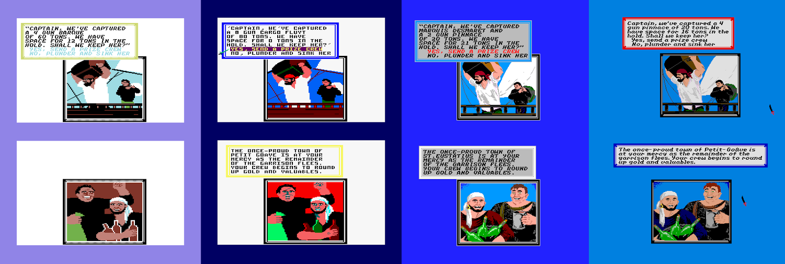 |
| Plundering ships and towns, left to right: Commodore 64, Amstrad CPC, Apple //GS, Atari ST. |
And here are - hopefully - the results of your battles. There is always the possibility that either your ship or the enemy's will crash and burn, upon which an appropriate picture is shown, but I chose not to include them here for the lack of time and energy after all the other stuff. A picture from the top row will show up, when you have successfully plundered an enemy ship, and one from the bottom row goes for plundering a town.
 |
| Plundering ships and towns again, left to right: DOS, NES, Commodore Amiga, Macintosh, Apple ][. |
Basically, all the top pictures look the same, or at least, are very slight variants of the original. Only the MACINTOSH screen features only the guy carrying the enormous wooden chest. The bottom row pictures have more interesting variants: the Group 1 pictures has the bottle-holding guy on the right, looking slightly to the left, and the bigger guy is holding his left fist over the other guy's head and his right hand is holding a big bag of treasure. For Group 2, the picture has the two men swapped their places, and the bigger guy is holding a mug of what I suspect is grog, which is why his face has a much merrier look. For some reason, the AMIGA version doesn't make the men appear in a friendly light at all - it looks like they're mostly annoyed by the ever constant 17th century paparazzi taking pictures even when the men are having a nice break. By contrast, the MACINTOSH version makes the two men look deliriously jolly.
Some of the versions also feature alternative pictures for plundering a ship, which shows a picture of the ship's loot room with no discernable action. It's much more difficult to see on any other version than the AMIGA one, so I decided not to include it for this comparison. There are enough Amiga-exclusive pictures around in any case.
 |
| Screenshots of taking sun sight. Top row, left to right: Commodore 64, Amstrad CPC, Apple //GS, Atari ST. Bottom row, left to right: DOS, Commodore Amiga, Apple ][, Macintosh, NES. |
For the later versions of the game, this feature was taken off for being a bit useless, and I can certainly see why. Taking sun sight would be the only means of determining your current position, were you not otherwise well aware of where you are, or where you are going. Since the original game had a map, you would rarely have to use the sun sighting system anyway. But this is how it looks like, in case you ever wondered.
Mostly, it's a slow thing to use, as you will need to wait for the sun to rise and move the sighter accordingly. Only the MAC version moves faster than a bullet, which also renders it pretty useless. But comparing the way it looks in all the versions would give pretty much a similar result as everything else so far, so why bother.
 |
| Treasure maps and found treasures, left to right: Commodore 64, Amstrad CPC, Apple //GS, Atari ST. |
One of the more exciting things in the game is to collect treasure maps and go searching for the buried treasures. It's really one of the most piratey things I can think of. So, one would expect that finding a treasure would be as exciting as you would imagine. It all depends on what the treasure chest looks like when it's opened, and even more so, how much is the loot worth.
 |
| Some more treasure maps and found treasures, left to right: DOS, NES, Commodore Amiga, Macintosh, Apple ][. |
The maps themselves are probably supposed to look like they were painted on a piece of leather, but basically, they're just a differently coloured version of the world map when sailing. Most of the versions actually follow the leather idea rather well, but the ATARI ST, AMIGA and MACINTOSH follow their own ways. Of course, they look as good as you would expect, but none of them really look all that realistic in colouring. The edges have been made better, though.
But the treasure... the original C64 picture is a bit of a letdown, and looks like something from an early 1980's text adventure at best. Even the AMSTRAD picture looks more proper, but then the Amstrad does have a way with colours. The same picture looks still better on the APPLE ][. As it happens, although these three look surprisingly far from each other in quality, we still get that Group 1 / Group 2 thing here. And of course, the Group 2 pictures are more exciting, and then they are beaten by the AMIGA picture. The MACINTOSH picture looks good, but without any colour, a treasure offers little excitement.
 |
| Pirate points after early retirement. Top row, left to right: Commodore 64 (disk), Apple ][, Apple //GS, Atari ST. Bottom row, left to right: DOS, NES, Amstrad CPC, Macintosh, Commodore Amiga. |
It's only sensible that the comparison will not show everything in the game, else it wouldn't be as interesting to play anymore, so before the available NEC screenshots will end the Graphics section, I will end the actual Graphics comparison with a random retirement score screen. You shall have to find out for yourselves, how will it look like when you end up in a prison, or perhaps get washed ashore after crashing all your ships, or maybe even find your lost family members.
It is recommended to divide the plunder within 2 years at maximum, because your crew will easily grow restless at being constantly at sea and having no fun with their portion. Once you have given your crew their portion of the collected loot, you are given an option to end the game, proceed to the next level, or just plan another expedition on the same level. If you decide that you have had enough and wish to end the game, you are shown the way your score has built up, and finally your ranking and pirate points. Apart from the C64 tape version, the ranking screen also features a picture of you in your rank, regardless of how low you end up. Strangely, the AMIGA version is the only one that focuses entirely on your character, instead of showing any background graphics, but then the picture is much bigger and better in every other way. As for the other pictures, it's all the same Group-based thing as it has been anyway.
 |
| Some NEC PC-8801 version screenshots that I pirated from MobyGames and lumped them together, because I couldn't get the damn thing working on my emulators. Yarrrr. |
From these few NEC screenshots taken from MobyGames (yeah, sorry about that), we can see clearly enough, that the graphics are pretty much styled after the DOS version, but the illusion of depth in the pictures has been made much worse, and the details are only made to resemble the source material. Initially, the graphics have an overall sharper look to them, and the most crucial bits look as good as you would dare to hope for, but it feels like a rushed conversion, and I can only consider it being on a similar level to the other 8-bit graphics. Then again, I haven't seen the NEC version in action, so I can't tell how good or bad are the animations - I haven't found any videos of it on YouTube either. But I can't really include it in the scores in any case, for reasons you already know.
So, we finally come to the end of the Graphics section, even though there are still plenty of things to see in the game. From what I have shown you, though, it's easy enough to come to certain conclusions. For one, the AMIGA version is very much superior to all the other versions in terms of colour, detail and amount of graphics. The MACINTOSH is superior to all the other versions only in terms of the quality and quantity of animation, and the hi-res graphics are a joy to watch, even though they're monochrome. Only the swordfighting segments are horrible to watch because they're so infernally slow, so it's very difficult to place it anywhere on the list, but I shall attempt to be fair. Then, there are the two Groups, both of which feature some differences in quality and quantity. The APPLE ][ version features the least animations, but the event pictures are more detailed and colourful than on the C64 or AMSTRAD. The AMSTRAD version uses a lower resolution for everything, and some of the colour choices are more awkward than elsewhere. Also, both the APPLE ][ and AMSTRAD versions run notably slower than the C64 version, and feature no scrolling, so the C64 version will win Group 1. The NES version looks surprisingly good, all things considered with most of the pictures derived from the 16-bits, and it's the only one alongside the original that features scrolling, so it's graphically the best one of the 8-bits. From Group 2, the A2GS version has the most pleasing basic palette, but the ATARI ST version has a nicer use of font, and some bits have been redesigned to look closer to what the Amiga version would look like later on. It's a tough decision, but here it goes:
1. COMMODORE AMIGA
2. ATARI ST
3. APPLE //GS
4. IBM-PC COMPATIBLES
5. NES / MACINTOSH
6. COMMODORE 64
7. APPLE ][
8. AMSTRAD CPC
---
SOUNDS
Being both an action/adventure game and a simulation of sorts, it's important to have a certain quality in the sound effects in the game. As it's also set in a certain timeframe, the music would need to be as closely related to the era as possible. Not a very easy task, but the good people at MicroProse have more or less pulled it off for the most part, unless you're very particular about getting the time period for the music correct. Indeed, while the graphics play an important part in the game, it's the music and sound effects that help building the atmosphrere more than graphics.
The original C64 game features seven short excerpts from Bach compositions (three from various Preludes, two from the Goldberg Variations, one from Sinfonia III and one from Inventio X), as well as three bits from Händel's Water Music. Most of them have their own specific uses, such as finding treasure or getting promoted by one of the governors, but on the C64, the music system isn't quite as advanced or logical as in the later conversions, and all of the tunes do not have a particular place - most of them are just played at random when necessary. At least the instrument of choice for all the tunes is fairly reminiscent of an harpsichord, which is very suitable. As I said, the time period for the music isn't entirely correct, since both Johann Sebastian Bach and Georg Friedrich Händel were born in 1685 - at the end of the game's time period. I'm not entirely sure what to think of the sound effects, though, which are fairly basic, but effective in a simulation sort of way - noisy digital wind blowing, elementary cannon shooting and crashing noises and cling sounds when swords make contact. It's more than adequate, but still feels basic compared to some other versions.
Bravely, they decided to go with some sort of a dual-tone sound for the APPLE ][ version, which isn't very capable of producing sounds, and the side-effect of getting more than one beep at a time out of the machine was a very irritating high frequency that is playing always along with the regular notes. This, if I recall correctly from other similar cases on the 48k ZX Spectrum, is achieved by alternating two notes at a very high rate, which makes the machine produce some sort of residue noise, which in turn makes most of the music sound slightly out of tune. I think they realized how awful it sounded, so they decided to give the player an option to have no sounds at all, which is really the preferred option here. The only bit which you cannot avoid is the music in the loading screen. If you do choose to listen to the music and sound effects for whatever reason, you should know that while there is enough of music there, some of the sound effects are missing, most importantly the wind noise.
From the other Apple versions, the black-and-white classic MACINTOSH version has no sounds at all, which automatically loses this battle. Happily, the A2GS version does have 16-bit sounds and good renditions of all the tunes in it. It also features one of the best sets of sound effects, specifically for the swordfighting bits, but curiously, there is no wind noise here.
On the regular IBM-PC compatibles, you will hear the same tunes as in most other versions, but in a similarly dual-toned manner as in the Apple ][ version, but this method hasn't been managed to get to sound as loud as on the Apple ][. But then, neither is the side-effect as horrible on the PC speaker. All the sound effects sound very much like any other DOS game - in fact, they reminded me mostly of Commander Keen than any other version of Pirates!, which should say a lot. The TANDY version features some more listenable sound effects and music. Strangely enough, it sounds very much like what an 8-bit Atari version would have sounded like - beepy three-tone music with no distinctive features to tell if they're supposed to represent any instrument, as well as strangely plasticky/electric swordfighting and cannon-shooting effects. An obscure combination, but it certainly works better than the regular PC speaker version.
Although the AMIGA version keeps the music closely related to the original baroque tunes, it has the audacity to make a joke out of it - which is a talent I admire immensely in any musician. Perhaps it's not faithful to the original in this sense, but then again, this is a game about pirates, and I'm guessing these pirates used to have their own rules regarding music as well as other things in their way of life. This adds a slightly unexpected pinch of humour into the game, which otherwise feels almost a bit too much like a serious strategy/simulation, rather than an adventure. The Amiga team even went so far with this soundtrack business, that they included a separate soundtrack section for the main menu, where you could listen to each song and see their descriptions. One of my favourites is the description for the tune used in the loading screen - Bouree from Suite 1 of Water Music by Händel (for harpsichord and flageolet): "As it turns out, the flageolet player brought the wrong music to the recording session: he plays a theme from a Mozart symphony and also the Sailor's Hornpipe." Priceless. Anyway, the sound effects are familiarly high Amiga quality with nice howling wind which makes you shiver, sampled gunshots and cannon blasts and all that sort. Only the sound effect for taking a hit while fencing is a bit unrealistic, but it serves a purpose.
The ATARI ST version sounds like a fairly basic soundtrack made for the AY-chip. All of the music is a bit similarly beepy as in the Tandy version, but with just a slightly more distinctive instrumentation. Compared to the Amiga version, the placing of all the tunes is a bit more random, and particularly the loading screen feels a bit odd, since it plays one tune first, and then loops a second one until the main menu has loaded in. But apart from the wind blowing, which sounds more like a vacuum sucking, the sound effects are actually rather good, and the swordfighting sounds are the best of what's around.
In the other AY-chip powered version, you get a much more scarce soundtrack, in both sound effects and music. The music sounds very much like the ST music, although it is perhaps closer to the Tandy music here, with less focus on how the music actually sounds. By scarce, I mean that the first time you will get to hear any music is when you manage to win a battle of any kind, and most of the occasions where music is played, have to do with achieving something. Unfortunately, the sound effects aren't much better, and are comparable to something between the Apple ][, PC speaker and Tandy sounds. The most baffling part of the sound effects is the wind blowing, which is normally completely silent, but whenever you get under a more powerful bit of wind, the sound is suddenly turned on, and the wind sound alters normally by its power, and of course, is turned off just as abruptly as it begun.
Last, but obviously not least, the NES version features all the 10 tracks featured on the 16-bits, as well as some occasional sound effects to go in the appropriate places - wind blowing, swords clinging etc. In addition to the normal set, the NES version has some extra tunes, most of which are rather unfitting for the game, and very Nintendoesque in their happy rhythms and melodies. A couple of almost proper waltzes have also been fitted in, but hearing regular 4/4 beat-based tunes in a baroque setting is, at least for me, unacceptable. Also, the overall sound of the music isn't very close to being baroque - and I don't really think the NES is even capable of producing such sounds.
And so we come to the results, which are more interesting than I expected them to be. The original C64 version clearly sets an example, which most of the conversions fail to follow even as good as they could. Still, the sound quality is even more clearly very much supreme on the 16-bits, none of which manage to get everything right. So, it's yet another case of not having an ideal version. But these are the results that I could come up with:
1. COMMODORE AMIGA
2. ATARI ST
3. APPLE ][GS
4. COMMODORE 64
5. NES
6. TANDY
7. AMSTRAD CPC
8. IBM-PC
9. APPLE ][
10. MACINTOSH
---
OVERALL
With modern technological advancements, any of these versions could be made quite enjoyable, so in that sense, this comparison has been a bit useless. But in case you are pondering on which version should you look out for, if you're planning on buying an original, this comparison might offer some direction towards making an informed choice. However, if you're planning on simply relying on the overall mathematical results, you might remain just as much confused as before...
1. COMMODORE AMIGA: Playability 5, Graphics 8, Sounds 10 = TOTAL 23
2. ATARI ST: Playability 5, Graphics 7, Sounds 9 = TOTAL 21
3. APPLE //GS: Playability 5, Graphics 6, Sounds 8 = TOTAL 19
4. NES: Playability 4, Graphics 4, Sounds 6 = TOTAL 16
5. IBM-PC COMPATIBLES: Playability 5, Graphics 5, Sounds 3 = TOTAL 13
5. COMMODORE 64: Playability 3, Graphics 3, Sounds 7 = TOTAL 13
6. MACINTOSH: Playability 4, Graphics 4, Sounds 1 = TOTAL 9
7. AMSTRAD CPC: Playability 2, Graphics 1, Sounds 4 = TOTAL 7
8. APPLE ][: Playability 1, Graphics 2, Sounds 2 = TOTAL 5
Remember, I'm not saying how good these versions are in the context of the machines they were made for, but in the context of the game compared to other versions of the game. I would imagine, each version probably offers a similar amount of nostalgia to any gamer who played Pirates! in their youth on their specific machines, and no matter what machine you were playing it on, it still must have been an overwhelmingly huge experience. And I have to admit, even the slowest versions become just as much fun as the best of them, when you turn the speed knob to about 200% on an emulator. This is simply because Pirates! is such an immensely enjoyable game, with less than usual importance on either graphics or sounds. It's the adventure you experience and the choices you have to make that makes it one of the most perfect computer games ever made, and I can only recommend it to anyone with any of the computers included in this comparison - even the skipped NEC versions, if you know how to read Japanese.
Still, if you're a fan of great graphics and sounds, you can't go wrong with the Amiga version. It's just that good. Other popular opinions are that the C64 and NES versions are superior due to the scrolling, but the fact is, they don't offer as much content. If you're looking for plenty of content, great graphics and even greater sounds, you might as well go for one of the remakes, which I will talk about next. But before going there, I might as well mention, that there was also a 48k Spectrum version planned, but never released. The only thing at WoS that would resemble the Sid Meier game even graphically was this strange Russian effort that seems more like an adaptation of a pirating-themed boardgame. But nevermind that, let's move on to the remakes!
---
THE OFFICIAL REMAKES
I'll make this one relatively quick, since there really isn't that much to talk about here. There are two official remakes of the game worth mentioning here: the 1993 remake called "Pirates! Gold", and the 2004 remake called "Sid Meier's Pirates!" with a subtitle usually not featured when listing the game anywhere (Live the Life). The latter remake was converted for mobile devices by Oasys Mobile in 2008.
 |
| Pirates! Gold, DOS version. |
In addition to the obvious differences in graphics and sounds, both games feature some differences in gameplay elements. For the most part, the playability in Pirates! Gold is similar to the original, but some things that were deemed a bit useless in the original have been removed, such as sun sighting and special items. There are some new features, however, such as an in-game map, possibilities to repair your ships at a shipwright instead of the merchant, and you can even practice fencing if you like, just to name a few. The Sega version even made you walk manually through the towns instead of clicking your way around, but it offered some other piratey enhancements that gave it a unique charm.
 |
| Pirates! Gold, Sega Megadrive/Genesis version. |
Pirates! Gold was released for Windows 3.1, DOS, Amiga CD32, Sega Genesis/Megadrive and Macintosh, and can be currently found most easily at GOG and Steam, but I think I would recommend the Sega version the most, because it offers such a different experience.
 |
| Pirates! - Live the Life, Windows version. |
Currently, the latest official remake is already 11 years old, and might require a graphical update, but at the time, it was a very welcome release. Not only did it update the game into the new millennium with its 3D graphics and new, almost Disney'esque piratey soundtrack, but it threw in a proper plotline to begin your game with. And these are only the most obvious changes.
As it usually happens, bringing in some new gameplay elements to a well-established formula has the probability to raise mixed feelings. It also happened this time with the inclusion of the follow-the-leader type ballroom dancing sections in the game, which act as a big part of wooing your potential marriage partners. Also, the swordfighting bits were changed from being carefully constructed real-time fights to more cartoony dance contests with more focus on the animations than the actual fights. One of the biggest, and perhaps the most controversial changes was to show all the other wandering ships in the world map, which took away much of the randomness of the game. However, since you can also see the other ships' owners and nationalities, it was easier to work your way up to the top of the notoriety ladder of all the Caribbean pirates - yet another new thing in the 2004 remake. There are some more new things in there, which might or might not be to your liking, but I will not spoil everything here. Instead, I heartily recommend you to try the new version out, but you should perhaps consider it more like a sequel than a remake. This one is also available to buy through Steam, but can also be found for the Xbox consoles, PlayStation Portable, Nintendo Wii Mac OS X and various iDevices.
And for now, that's all folks! Have a great rest of the summer!
This was the first game I've seen on the amiga. It was the tavern keeper screen and my jaw almost dropped. I didn't know that the Amiga was a late conversion, but that explains why it looks so much better.
ReplyDeleteI even prefer its look to Pirates Gold! and the 2004 remake.
Such a great game.
ReplyDeleteCPC versin was sadly very slow and the graphics ported from C64 lacked luster with very often poor use of CPC's palette. Else it was a nice version Pirates, this game is basically good on every version. It used the CPC6128 specs (disk+128k).
Just discovered and acquired a Japanese version of Pirates for PC-9801 computer! For me, the C64 version is the one that I played a lot... and still enjoying it on my old commodore computer.
ReplyDeleteCongratulations on your find! Would it be possible for you to either transfer the game disk(s) into image file(s) or at least take some screenshots or photos of the PC-98 version? These sorts of things are so freaking difficult to find from the internet otherwise, perhaps unless you speak Japanese... =(
DeleteAn addendum to the sound of the ATARI ST version:
ReplyDeleteThis version featured support for MIDI instruments.
Well, I first played the game on the C64 and I can say I'm a huge fan of this one! In the following years, I've tried it on many 16bits, searching for a kind of "perfect" version, but was always disapointed... Overral, most conversions lack the scrolling and this is a real let-down: the screen flipping is annoying (the player's ship is no more centered on the screen), making exploration choppy and more difficult. Even the amiga version, which is very nice graphically, does not scroll... The IBM PC release had moreover very awful sounds.
ReplyDeleteI'have tried it on other 8 bits too: did you know the CPC game was converted line-by-line from the C64 version? That explains it is a faithful conversion of the original, but in terms of content only: the game is rather painful to play since all action sequences (sailing on the map, attacking ships, fencing, etc...) are badly animated and have very unresponsive controls.
That said, the 2004 remake is really great, and I will try the NES and Genesis version, didn't know they exist until this review...
Yeah, I get your point, and I saw similar comments about scrolling quite a lot when doing the research on this comparison. I just don't put as much weight of importance to it when it comes to this particular game, because until the 2004 remake, I always felt the original Pirates! to be a bit cumbersome to play. Content, some finer details in the inner workings of the game and its controls are what makes Pirates! what it is, and from the available lot, you can only really have a personally optimal version. Too bad, but that's how I see it. But hey, thanks for your comment - I really do recommend the NES and Genesis versions, if only for the sake of having then tried them out. =)
DeleteHi, I just wanted to say a big thank you for this tribute to Sid Meier Pirates! This was one of my favorite games on C64 when I was a child... I played it for years and years. And many years later I played the PC version. I think this game had influence on my whole life and still today I play a Role Play game inspired by Sid Meier Pirates! and I have probably watched every possible pirate movie...
ReplyDeleteThanks to you, I'm now listening to these "magic" music pieces of Bach and Handel.
Thanks for your comment, Laurent! I guess what you described is exactly what really good games do to people - inspire and influence in more ways than just what kinds of games you like to play. Pirates! is definitely one of the games that can get you sucked in like that, and the music is definitely a big part of it, to get a better sense of period and even the terroir, if you excuse my French.
DeleteI played the PC Booter version on my 286 with a VGA card and i really loved that game. It only offered a CGA+EGA mixed mode and only PC Speaker sound, as far as i can remember, but it was still a great game. And the PC was a relatively fast machine, thus loading times were low.
DeleteLater i bought the Pirated Gold Edition, but it had some bugs and i really prefered the original version. But the original version was difficult to run, because the Booter Disk expected to have the 5.25" drive as drive A:. That was at a time, when i had my 3.25" drive as drive A: because this allowed MS-DOS boot disk with more space available.
Thus playing pirates classic would have meant to open the PC case and switch the drives. It was not possible to trick the game my some sort of software boot menu. It expected the game always on drive A.
That's why i was stuck with the Pirated Gold version.
The second remake with 3d graphics was a relief. It was much better than the Gold version and offered more features. Thus i am quite happy with the new version of Pirates.
Yeah, older disk media on newer PC's, even when emulated, can be a bit iffy at best. DOSbox isn't really the most compatible DOS emulator out there, but it's the most accessible, but you can get the booter version to work with DOSbox with a bit of dabbling. Getting to play the original PC version on proper old PC hardware can be a bit of a mess, though, I agree. Happily, there are other versions to choose from. ;-)
DeleteAnd the C64 versión was coded in BASIC!
ReplyDeleteThis is my "Madelaine de Proust". And few months ago, i found a fantastic game: Beyond New Horizons (free) and Maelstrom New Horizons (engine to buy, but games are free). A nice community of programers offers us the best pirate'slife simulation actually.
ReplyDeleteIf you stayed pirate, it is all you dreamed of. Have to give a try.
what an effort! as epic as the game.
ReplyDeletemight point out one minuscule error: Kennedy Approach has nothing to do with Sid Meier, being created by Andy Hollis (and his team).